

Part eight of this series picks up where we left off — looking at a process that takes images from 100% black to the original image and then to 100% random noise. If you wish to catch up, see:
Assuming you’re up to speed, I left off talking about…
Blanking Modes
As covered last time, there’s no significant difference between black, gray, or white with regard to replacing or fading an image.1 In what follows, I’ll use black as the “blank” color.
There was a significant difference between replacing a percentage of pixels with black versus fading all pixels a matching percentage towards black. I think it’s possible the difference is meaningful, so in what follows, I’ll include examples of both.
Here’s a link to a Note with a table of data from my blanking experiments. Sorry for the image rather than a table, but Substack is limited is strange ways.
Crossfading from Black to Image to Noise
In this context, a crossfade is a series of images that starts with a 100% black image, progresses to the image, and then progresses to 100% noise. Previously, the original image was at one end of the progression, now it’s in the middle.

We perform the same numerical analysis on the images, but now they progress from the extremely compressed 100% black image to the incompressible 100% noise image. The original image — with its characteristic compression — is in the middle of this series, which gives this center point a lot of control over the curve.
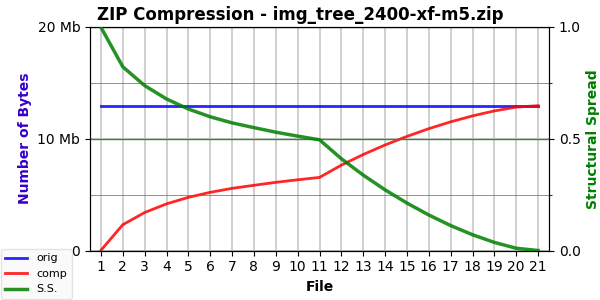
Let’s start with the two simpler camera photos, “Tree” and “Clouds”. The former has SS=0.495 and EF=1.577. The latter has SS=0.572 and EF=1.561.2
Here’s the crossfade chart for “Tree”:
And here’s the chart for “Clouds”:
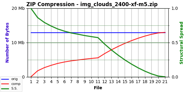
On the left, the highly compressible black image. On the right, the incompressible 100% noise image. File #11 is the original image.
Note that these comprise two distinct series of images and, thus, two distinct curves. The join is the original image (file #11). These use Mode 5 for the left curve because it increases the curvature.3 All crossfade sequences use Mode 0 full-spectrum noise for the right curve.
Here’s the chart for our friend “Bentley” (SS=0.430, EF=1.708):
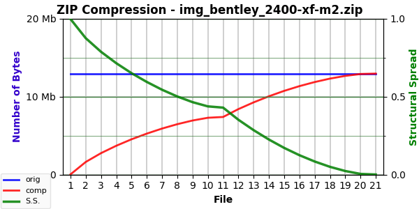
The above uses Mode 2. To give you a chance to perform your own blink test, here’s the Mode 5 chart:

To see a hint of the difference, look where the green line crosses the blue line. Of key interest in these is where the green line is for file #11, the original image. Check where this point, the characteristic compression of the image, is relative to the 0.5 horizontal (see right side of chart with normalized compression scale). The simpler “Tree” and “Clouds” image were above 0.5 — the “Bentley” image is below.
For completeness, before we get to some more interesting examples, here’s the chart for “Oranges” (SS=0.355, EF=1.877):
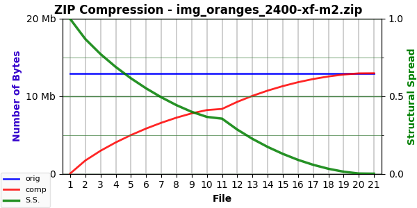
I used the Mode 2 chart this time because, in this case, it has a slightly deeper curve — an anomaly to explore another time. (The difference requires a blink test to spot, so it’s slight but definitely there.)
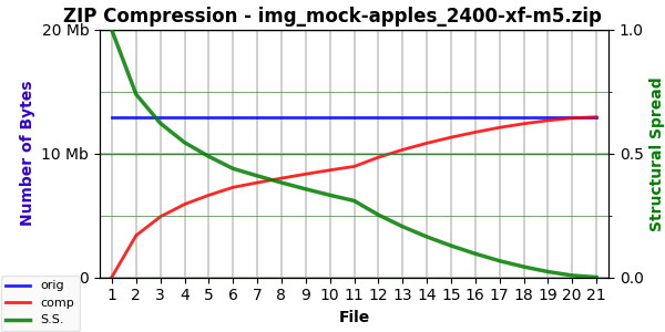
The “Mock Apples” image has a lot of detail in it (SS=0.309, EF=1.636):
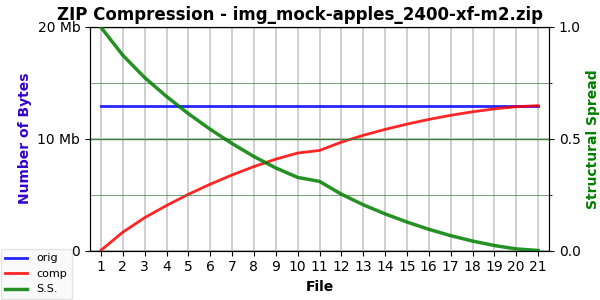
In this case, the Mode 2 chart (above) and the Mode 5 chart (below) is very noticeable:
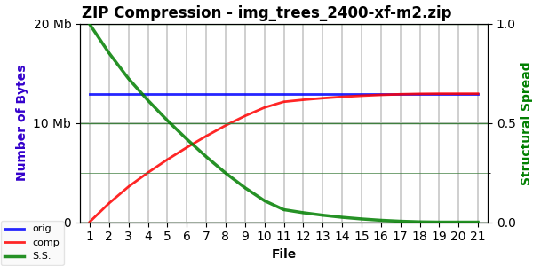
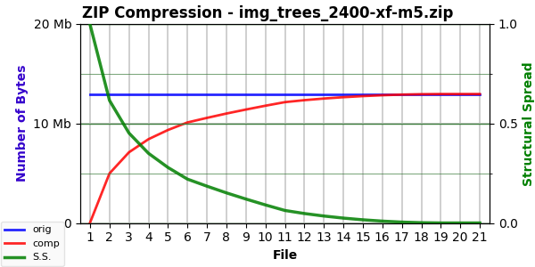
But the winner in camera photos is “Trees” (SS=0.063, EF=2.450):
Here, again, the difference between the two modes is easily visible:
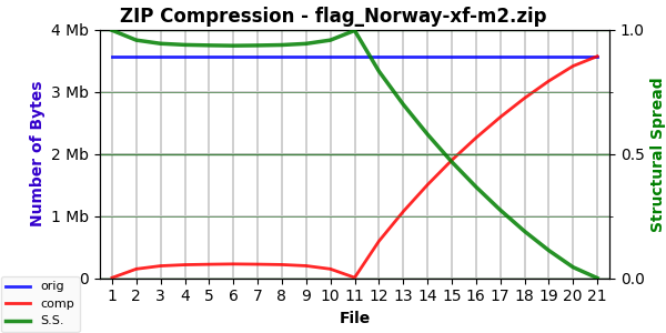
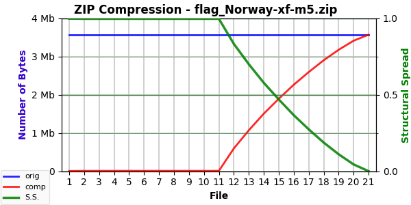
On the extreme other end of the scale, simple images like the three flags (all have SS values near one and EF values around 1.4):

All have similar Mode 2 curves:
Their Mode 5 curves show the near flatline curve we saw last post:
The “Mandelbrot 02” image (SS=0.808, EF=1.447) is between “Tree” and the flags images in terms of complexity and, thus, its curve:
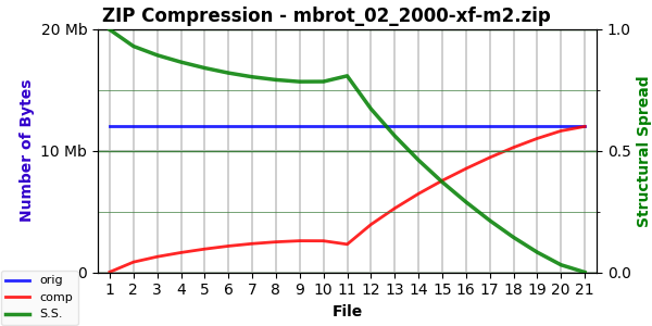
Another anomaly: the Mode 5 version has less curvature. It’s close to a flat line from the upper left to the characteristic compression point at file #11.4
Rather than show you all the graphs for all the images, here’s a chart showing the Emergence Factor (EF, which comes directly from the compression curves shown above) as well as the ESC value:5
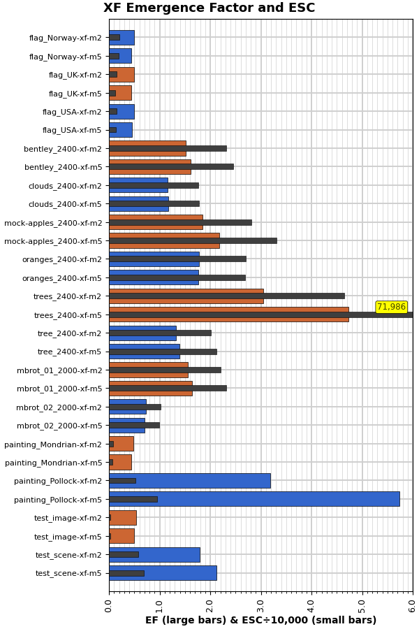
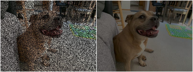
The notable outlier is that “Trees” photo, which has an extremely high ESC when using Mode 5 but a reasonable one when using Mode 2. For reference, here is that “Trees” photo again:
One observation is that the Mode 2 and Mode 5 versions seem most different when the image has a lot of detail. Or when it has very little. But in the former case, the Mode 5 version has a larger EF, whereas in the latter case it is slightly smaller. This suggests that the Mode 2 group is less sensitive to detail than the Mode 5 group. Something to think about if I someday return for another round.
For whatever it’s worth, here’s the raw data from these crossfades:
Filename                   Max-Size         AC    SS     EF          ESC
flag_Norway-xf-m2         3,575,094      4,242  0.999  0.491       2,081
flag_Norway-xf-m5         3,575,094      4,242  0.999  0.442       1,873

flag_UK-xf-m2             2,457,654      2,935  0.999  0.494       1,449
flag_UK-xf-m5             2,457,654      2,935  0.999  0.445       1,304

flag_USA-xf-m2            2,588,214      3,087  0.999  0.498       1,534
flag_USA-xf-m5            2,588,214      3,087  0.999  0.450       1,386

bentley_2400-xf-m2       12,960,054     15,249  0.999  1.522      23,186
bentley_2400-xf-m5       12,960,054     15,249  0.999  1.612      24,553

clouds_2400-xf-m2        12,960,054     15,249  0.999  1.160      17,673
clouds_2400-xf-m5        12,960,054     15,249  0.999  1.169      17,811

mock-apples_2400-xf-m2   12,960,054     15,249  0.999  1.844      28,088
mock-apples_2400-xf-m5   12,960,054     15,249  0.999  2.176      33,144

oranges_2400-xf-m2       12,960,054     15,249  0.999  1.777      27,068
oranges_2400-xf-m5       12,960,054     15,249  0.999  1.770      26,963

trees_2400-xf-m2         12,960,054     15,249  0.999  3.048      46,421
trees_2400-xf-m5         12,960,054     15,249  0.999  4.726      71,986

tree_2400-xf-m2          12,960,054     15,249  0.999  1.324      20,171
tree_2400-xf-m5          12,960,054     15,249  0.999  1.399      21,304

mbrot_01_2000-xf-m2      12,000,054     14,130  0.999  1.559      22,003
mbrot_01_2000-xf-m5      12,000,054     14,130  0.999  1.641      23,166

mbrot_02_2000-xf-m2      12,000,054     14,130  0.999  0.726      10,251
mbrot_02_2000-xf-m5      12,000,054     14,130  0.999  0.704       9,930

painting_Mondrian-xf-m2   1,364,230      1,651  0.999  0.487         803
painting_Mondrian-xf-m5   1,364,230      1,651  0.999  0.443         730

painting_Pollock-xf-m2    1,364,230      1,651  0.999  3.189       5,259
painting_Pollock-xf-m5    1,364,230      1,651  0.999  5.732       9,453

test_image-xf-m2            472,174        598  0.999  0.538         321
test_image-xf-m5            472,174        598  0.999  0.497         297

test_scene-xf-m2          2,732,310      3,252  0.999  1.795       5,832
test_scene-xf-m5          2,732,310      3,252  0.999  2.120       6,885
The SS is universally nearly one because the black image compresses so much. The low AC values reflect that, too. What changes is the EF value, and it appears it is sensitive to the mode of blanking.6
Also of note: “Trees” now has the highest ESC value, which is as it should be. And very simple images, such as the flags or my fake Mondrian, have very low ESC values — also as it should be.
And on that note, I think I’m about done here. But, if baseball is like life, then life is like baseball. Which is to say, there will (probably) be a ninth inning just to summarize and wrap things up.
Or not. Depends.
Until next time…
There was a tiny difference between gray versus white or black. (And a close examination shows some even tinier variation on that theme.)
All camera photos are in the 2400×1800 resolution unless otherwise stated. And the SS and EF values are from the previous Mode 0 randomizing process.
Slightly. It takes a blink test with the Mode 2 chart to see the difference.
The “Mandelbrot 01” image is roughly similar to the “Bentley” image.
Which is more constrained with the crossfade series.
Possibility also to the randomizing side of things, but I haven’t explored that. Mainly because there seems only viable randomizing mode.