

Caveat Lector: This is a Junk Drawer post, which means it’s especially technical and very niche. This is part two of a series of posts going into great detail about the complexity rabbit hole I’ve been exploring recently — a journey triggered by Joseph Rahi’s April post, A Formula for Meaningful Complexity. That post is required reading to make sense of these posts.
As is part one in this series.
Complexity and Meaning
Last time I introduced the dual notions of complexity and meaning. The former isn’t that hard to define — I’m exploring it in detail in this series — but the latter has a subjective aspect that makes it tricky to pin down.
Remember the common example of complexity (and thermodynamic entropy) where cream is added to — and then mixes with — coffee:

Thermodynamically simple at first and even simpler when fully mixed.1 As discussed last time, one measure of its complexity is what it takes to describe the situation. That measure of complexity rises and then declines over time while entropy constantly increases.
But what is the relationship between complexity (or entropy) and meaning? Which is the most meaningful state of the coffee and cream? If the goal was a smoothly mixed beverage, then the final state is most meaningful — the mixing process has completed. On the other hand, surely the intermediate states where the cream sends tendrils into the coffee (and vice versa) is the most beautiful and interesting visually. Even if the final state is the ultimate goal, enjoying the visual display of the process can be filled with meaning.2
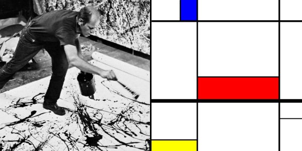
In terms of visual appeal, it’s the more complex states of the coffee and cream that attract us. Just as we enjoy the essentially random (and thus complex) visuals of ocean waves, campfires, clouds, or forests. For that matter, consider the paintings of Jackson Pollock or Piet Mondrian.
We’re attracted — at least visually — to complexity and or randomness. Things that are visually random are often also complex by some measure.3
Compression
Which brings us to the role compression plays as a metric for complexity. I introduced this last time, and it’s a key aspect of Rahi’s approach. There is a strong inverse correlation between how random data is and how much it can be compressed. Fully random data usually cannot be compressed at all.
Randomness and entropy are directly linked. The more random something is, the higher its entropy, though with entropy scale matters. Fully mixed cream and coffee has the highest entropy but — as we’re discussing here — has the least complex description and therefore somehow seems less random than the tendrils.
The dissonance comes from scale. At our human visual scale, the tendrils seem fascinatingly complex and much more random than fully mixed coffee and cream. But at the scale of molecules, the fully mixed state has far more possible arrangements of those molecules than the tendril states. While the tendrils appear random to us, on the small scale they have considerable structure or organization.4
In terms of compression, if we had closeup images of the various states, we would find the tendril states least compressible. The initial state, with areas of plain coffee and plain cream, would compress well. The fully mixed state would compress even better. Both cases are easy to describe because they’re simple at the macro level.
The structure of the tendril states requires more description and is thus harder to compress.5 Likewise, images of campfires or ocean waves or forests. The bottom line is that it seems structure is a key to our visual interest, and the compressibility of an image (or a text) is a good indicator of how much structure it has.
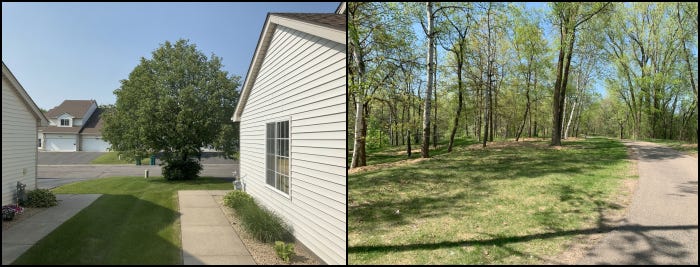
For instance, recall how the images above compress quite differently. The view out my office window (left) compresses to between 46% to 60% of its original size whereas the picture of trees in the park (right) compresses to only 90% to 92% of its original size. Both pictures are the same size in terms of pixels.
Above I wrote that one compresses from 46% to 60% and the other to 90% to 92%. The range is due to the actual photo size:
400×300: 60.79% and 92.22%
1200×900: 54.04% and 93.87%
2400×1800: 50.47% and 93.72%
4032×3024: 46.06% and 90.41%
This isn’t surprising. The larger the file, the more the compression algorithm has to work with in finding repeatable patterns that can be reduced to smaller tokens. Compression is sensitive to file size.
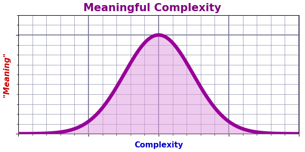
Meaning
Perhaps rather than charting meaning, the bell curve above charts interest or appeal. Meaning may be too subjective to quantify. Interest seems based at least in part on amount of structure or organization.
A word also about the difference between random and simple. We tend to link random with complex and thus simple with nonrandom. But be careful. A single coin flip is random (or at least random-ish). My attempt at a Mondrian above is pretty simple but also pretty random. It compresses to 0.45% of its original size (from 1,364,230 bytes to a mere 6,101 bytes) whereas a same-sized image from a Jackson Pollock painting compresses to only 95.70% (a whopping 1,305,560 bytes) — hardly any compression at all.
A real Mondrian would also compress to a very small size, but the relative compression between Mondrian and Pollock paintings says nothing about their meaning or interest. Even as “worthless” reproductions, they bring beauty and joy, so their meaning is not only subjective but not necessarily tied to their complexity. All we can objectively try to measure is structural complexity.
Emergent Structural Complexity (ESC)
Last time I also introduced the ESC formula that Rahi came up with:
Where:
AC is Absolute Complexity. This is the compressed size of the original.
SS is Structural Spread. This is a measure of the compressibility.
EF is Emergence Factor. This is a measure of the compression curve.
The AC is meant to be the smallest possible size of the text or image. We’re using compression because it’s an easy metric, but file compression may not actually offer the smallest possible size. Kolmogorov complexity is a metric that speaks to the smallest possible algorithm that can generate the text or image in question. We can view a compressed file plus a decompression algorithm as giving us a rough cut at the Kolmogorov complexity. Detailed analysis of a given image or text often allows a smaller algorithm, but as a general approach, compression suffices.
Note that AC is just a number (not a ratio), and this makes the ESC sensitive to file size. As we’ll see in future posts, I’m not entirely sure the ESC value turns out to meaningful because it varies widely with file size even when dealing with the same image.
The SS uses a simple formula:
The minimum-size is the AC value just discussed. The maximum-size is effectively the file size of the image or text. The notion is of a fully randomized text or image that cannot be compressed. (More on that in future posts.)
Note that, if a file cannot be compressed, the numerator in the fraction becomes zero, so an uncompressible file has SS=0. The minimum size can presumably never be zero, so SS can never quite reach 1, but the closer it is, the more compressible the file.6
The EF uses a slightly more complex formula:
But it’s not as scary as it may look. It’s just saying that EF is another ratio that we symbolize with A/B. The numerator of the fraction (A) is the area below the compression curve, and the denominator (B) is the area above it. So, A/B is the ratio between those two areas.
In the above, V is a vector (aka array, aka list) of compression values for an image or text that we’ve progressively made more and more random. Typically, we have eleven images from 0% randomized to 100% randomized in 10% steps (but we can have as many steps as we wish). However many steps we do use, V is a list of the size of each compressed step. N is just the number of steps.
Importantly, note that V(0) is the largest — the fully randomized file with zero compression. At the other extreme, V(N) is the smallest — the most compressible (presumably the original image or text).
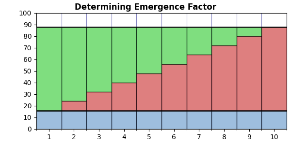
Note that the part in big square brackets is the same both places it appears. This is just a summation of all the compression values in V — the total area below the curve. In the graph above, this would be the sum of the red bars combined with the blue bars. The (N+1)⋅V(N) part gives us the area below the minimum value — the blue bars below the lower black line. We subtract this from the summation to give us the area of the graph below the curve but above the minimum. The red bars only.
The (N+1)⋅V(0) part gives us the area of the green bars, the red bars, and the blue bars. We then subtract the summation (red + blue) to give us the area of the green bars. Thus, EF is the ratio between the red bars and the green bars.
If the compression curve is linear, we get a graph like this:
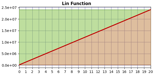
In which case the area above matches the area below, so EF=1.0.
If the compression curve is logarithmic, we get a graph like this:
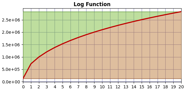
In which case there is less area above the curve than above, so EF < 1.0. The greater the curvature, the smaller the EF value.
If the compression curve is exponential, we get a graph like this:
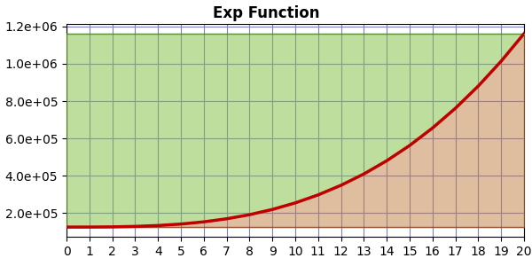
And now there is more area above the curve than below, so EF > 1.0. In this case, the greater the curvature, the bigger the EF value.
The bottom line is that EF is sensitive to the curvature of the compression curve.
Substack is whining at me about post size now, so I’ll end here. Next time I’ll start digging into what we get for SS and EF with various images and texts. It turns out that EF does seem to be telling us something about content.
Until next time…
To put it technically: when the system reaches equilibrium.
Hence the latte and cream art of baristas.
But not always.
As do campfires and other examples of visually appealing (apparent) randomness.
At this level. If we were to describe at the level of each molecule, each state would have the same size description: the list of all the molecules and their locations.
If the SS value ever reached 1.0, it would mean the file compressed to zero size!
Ah OK, interesting. I think if you're looking at a high resolution image, the measure should be considered as working correctly if ESC goes up as the resolution goes up, since it is dealing with a genuinely more complex subject (a higher resolution image). It's only if the increased resolution does not add any more detail (eg with the flag) that we should hope for ESC to remain constant.
I also set up "normalised" ESC to help compare across resolution sizes, which divides the ESC by V(0), and manages to remove most of the variance. You might find that value/formula preferable or more insightful?
I'm enjoying this, thanks for investigating it further!
>"Note that AC is just a number (not a ratio), and this makes the ESC sensitive to file size. As we’ll see in future posts, I’m not entirely sure the ESC value turns out to meaningful because it varies widely with file size even when dealing with the same image."
How much variation are you seeing? I did notice there's a fair deal of variation at lower resolution, but as resolution increases it seems to level off gradually. Which makes sense because for a simple image (eg the French flag), the AC should stabilise/converge with increased resolution, and SS should tend towards 1. Although I'm not sure exactly how EF should behave...